Keeping your scales intact is one of the cardinal rules of serious data visualization. In fact, chopping the axes is one of the most common forms of data manipulation. Stretching or squishing the scale is equally taboo.
The following charts all show the price of BMW shares from January 2, 2007 – May 3, 2007. See for yourself how their impact varies based on the chosen relationship between width and height.
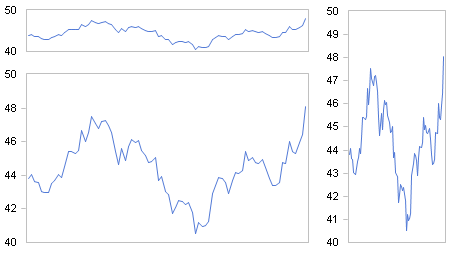
Then again, it really depends on what you need to communicate. The following examples again show the stock price for BMW with the same aspect ratio. However, one uses a zero/maximum and the other a minimum/maximum scale. The message they deliver couldn’t be more different.
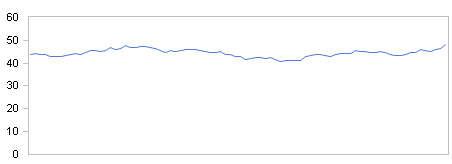
Zero/maximum scale
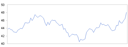
Minimum/maximum scale
Both scales, however, have their validity. Short-term fluctuations are irrelevant for long-term investors. Others who speculate with large sums in short-term investments need to take advantage of daily price fluctuations.
A good presentation of data, therefore, should fulfill the needs of the audience.
