When it comes to management information, where do we need to be careful? What topics are driving the scene? What roles do resolution, eyespan, and scaling play in creating quality reports? Why do people talk about traffic lights, gauges, and dashboards? Is PowerPoint really dangerous? These are questions that have shaped us – and our software – for years.
If you overhear the presentations or conversations during the breaks at our events, you might be surprised to hear a colorful mix of terms from business, IT, psychology, and even neurobiology. While some are marketing terms or buzzwords, others are backed by positions or findings. All refer to methods, content, form, or design. Since we would like you to join the dialog, we have created a list of terms which we feel are important and have explained what software can do to make business more intelligent.
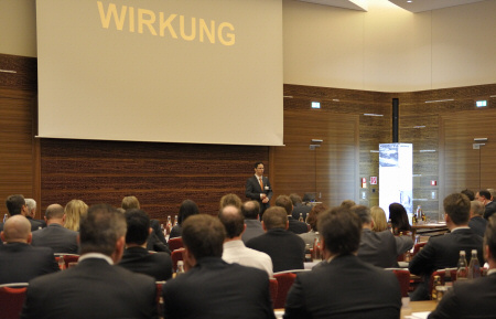
“Wirkung”, which means “effect” or “impact” in German, is often a topic of discussion at our forums in Germany. So what factors determine if the effort that you put into management information really pays off?
Analysis templates → Templates
Animation
Rarely used in management information. There is great potential for using animation in tickers, time lapses, slow motion as well as through changes in size and positioning. Here, too, you need to follow a few simple rules if you don’t want the eye candy to strain your vision. Columns that blossoms from the center instead of growing from the base (which would visualize the different heights by making them grow longer) is one example of poor animation. DeltaMaster animates portfolio analyses and sparklines, displays images and text as tickers, and uses sound animation.
Arrows
Common symbol for change – simple, yet very rough. If you understand things quickly, you also presume that there is more to it – namely, a trend. Bella has already criticized that. We feel that writing the change as a percentage is often more useful and just as easy to understand. DeltaMaster only uses arrows to designate actual trends that it has automatically calculated – and draws them using various slopes.
Attention
A bottleneck through which all management information must pass. Its capacity is often overestimated. Everyone knows that time is limited. Attention is even more so because it is strenuous and people are lazy by nature when it comes to thinking. Findings in the field of brain research show why. “Thinking is expensive,” explains the neurobiologist Prof. Gerhard Roth. Since the human brain requires so much energy to think, it primarily makes the effort when it subjectively views something as being new and important.” Deep understanding, however, also requires a bit of contemplation. The Report Weather of DeltaMaster uses colors to grab your attention and a hierarchal information concept to direct your attention. That is something at least.
Attributes
Characteristics of members or a group of them. Attributes are very important in modeling and can contain information such as article numbers or long and short names. They usually end up in analytic data models – typically, in alias columns where they can be displayed as alternative or additional information. Attributes with the same characteristics for multiple members can be combined into groups and aggregations, if required, on multiple levels. This structure determines if you can make generalized statements about the data. In this context, something that we call an “Easter egg paradox” also occurs. If you assume that there are correlations between revenues and industries, company size, regions, etc., these attributes must also be available as dimensions and – through a rough aggregation – allow value clusters. DeltaMaster offers clever options to deal with aggregations – subsequently, dynamically, or in a data-driven way.
Bar chart (→ chart)
One of the most important → chart forms in our opinion. Since they fit so well in → graphical tables, bar charts have made many space-consuming, hard-to-label business charts obsolete. It is easier to compare the length of bars than the height of columns. You can use bars to display structures and columns primarily to show time series.
Big Data
A rather vague term. It implies the shock of how much data there is today and the hope that you can so something worthwhile with it. We feel that → data mining has grown up. New databases that can store masses of data in memory (see also → in-memory computing) is breathing new life into data mining, simulation, and real-time applications for financial controlling and marketing. Critics say that quantity does not automatically mean quality. That is true. (See also → data collection.) DeltaMaster treats big data in different ways. Data mining algorithms profit from the access rules quite differently. Some are ultrafast in OLAP databases while others only perform well on relational data. Some even work best with hybrid data access.
Boardroom Solutions → Control Centers
Caption
An important design element that is often overlooked. Readers stumble over inconsistent terms, confusing abbreviations, complex references, and long legends – and get sidetracked quickly or loose the → attention. In borderline cases, the caption determines if a very good report is useless . In corporate environments where employees frequently come and go, using terms that only insiders understand is unproductive. In DeltaMaster, you can administer and maintain long and short descriptions, automatically generate dynamic captions, and do other helpful things to support your readers.
Central report
Our tried-and-tested standard for financial controlling reports as a → graphic table. You can use the same layout and reading order of the measures and comparison method (e.g. cumulated, budget/actual) for many different report topics such as P&L, cost accounting, sales statistics, production output, human resources, or transportation logistics. The central report is one of the → templates in DeltaMaster. It defines how to use sparklines and graphical elements so that readers can recognize patterns to quickly understand the company’s status quo and identify the causes in the necessary detail – all in the same report.
Change Blindness
A challenge in designing information. People overestimate how reliable their own perception is. People basically oversee more than they actually see. People can overlook even major changes, (for example, between two pictures) if they are focused on something else or distracted briefly. DeltaMaster deals with this phenomenon by applying ‘A subtle, yet bold statement‘. Large colored signals grab your attention while smaller ones direct your attention to details and underlying causes.
Chart (bar, column, line, pie)
Graphical coding of numbers. Most common forms today were invented over 200 years ago and have not developed much further since. It appears that misunderstandings and manipulations are quite common – oftentimes because the authors do not know any better. In recent years, there has been much debate about new graphical forms. → Sparklines are one of the greatest innovations. We have made great efforts to replace the typical, space-consuming (→ resolution) charts through → graphical tables. Bella regularly tears apart → infographics from daily newspapers and shows better alternatives.
Cloud
Data centers that deliver applications through the Internet or another network. In the case of management information, cloud computing often means using a browser as a front end to data that can be located anywhere. That is a prerequisite for interactive mobile applications. The benefits that users have from cloud computing depend on how well the applications can work around the limitations of browsers. DeltaMaster supports browsers and mobile devices with gestures as a hybrid app that works as a native cover for a browser. That makes it an elegant and efficient solution.
Colors
An important design element in reports. Colors make us happy and add a certain “wow” factor. Colored pictures are easier to remember than black-and-white ones. There are many arguments for the extensive use of colors. Yet when everything should be uniform, you quickly run out of color options. Bella has frequently discussed this topic. Even when CI intervenes, there are few conventions to keep in mind – for example, that positive numbers should not be written in red even if the color is a core element of the CI. The word is starting to spread that red and green do not contrast well due to physiological reasons. As a whole, colors are a difficult subject where less is definitely more. The → notation of colors in DeltaMaster is radical and simple. Blue is good; red is bad. It also offers a carefully chosen palette for color legends.
Column chart
A common form of → charts that are especially suitable for displaying → developments over time. You can even recognize different time intervals when the columns are very small, which is not the case with → lines. That’s why column charts are our preferred format for → sparklines in a → gross margin calculation during the fiscal year. If you are working with long time series and values that grow from period to period and can create trends, line charts are the better alternative because you can use a → logarithmic scale to make several series comparable. Since the text runs at a 90 degree angle to the slim column, labeling is often difficult. DeltaMaster can integrate columns in → graphic tables and place labels in an upright position.
Column headers
Top row of a table and column label. Headers play a central role because their arrangement determines the order in which you read and process them. Column headers are a component of → report rules. They are well done when you can read and process them in the same order without your eyes needing to jump back and forth. In DeltaMaster, we have standardized column headers with → templates.
Comparability
A criterion for quality reports. When things are placed next to each other, people inevitably compare them and check for correlations. Bella criticizes that many newspapers set a bad example and place time series of indexes next to each other but without using a comparable scale.
Comparison
A statement about data. Gene Zelazny names five basic types (i.e. structure, ranking, time series, frequency and correlation comparisons) which, in turn, correspond with different chart types (i.e. circle, bar, column, or curve charts, histogram or frequency curves, and dot charts). We feel that regional comparisons with maps, position comparisons in a matrix (→ portfolio analysis), comparisons of different concentrations (→ concentration analysis), and comparisons of → variances are also important. DeltaMaster offers these chart types as built-in features.
Concentration (ABC) Analysis
An instrument for analyzing risks. A concentration analysis, for example, can reveal if a company generates a significant percentage of revenues with just a few customers or products – the so-called 80:20 rule. In DeltaMaster, you can then group these customers or products into new classes and examine them further.
Control centers
Visualizing business-critical data in → real time. Control center solutions are best implemented on large-screen monitors with high → resolution to ensure you have adequate room to see the big picture as well as detail.
