When you look at many management reports, you could think that you were standing in front of a photograph or painting that doesn’t have a main motif. If all image components are treated equally, it is hard to see the message. Today, we’ll talk about the punctum – in short, the point – and how to get to it.
For my birthday, I received a book written by Eva Witzel about the photographer Andreas Gursky. As I leafed through it, I quickly realized that there wasn’t a single picture in it! Somewhat restrained, I began to read. She wrote about Gursky’s Betrachterstandpunkt, which roughly translates to a viewer’s point of view, as well as horizontal order and vertical accents. It read like a doctoral thesis, the result of many long years of research on a very specific topic. And what do you know? It really was.

In this “report”, the punctum is clear as a bell: € 4.80. S’il vous plaît, Monsieur.
I read a bit further. On page 166, she included a saying of Bertolt Brecht from 1931 who believed that if you just show reality you don’t get reality. Here, too, she talked about the punctum – or, in plain English, the point. When a picture only contains components of equal weight, the reader can no longer see why someone wanted to capture this situation in the first place. The picture appears to be empty. It sends the observer on a search. With a bit of luck, he or she might discover the punctum unexpectedly during a neutral observation. Emotional, irritating, animating – for analysis above and beyond what is seen.
If that’s not food for thought – especially in management reporting! We had already explored the concept of a viewer’s point of view as a fundamental question for management and financial controlling. Reflecting reality so that it makes a statement is a short way to describe the unappreciated task of creating management reports. Last but not least, we are constantly searching for the punctum in an analysis and we show it in a report. Uli Drautz, a member of the supervisory board at Bechtle, described the punctum at our Executive-Forum in Berlin as follows: “Aha. The point. Got it. Take action!” This sentence alone was the punctum of his presentation.
No one can bring the word punctum to the point any faster. Uli Drautz, a supervisory board member, talks about reports that provoke readers to take action (in German).
Action Title
Strategic consultants don’t wait for the punctum; they place it at the head of their reports. An action title describes how the readers should interpret the data and, if possible, what they should do next. Wouldn’t it be nice if management reports strutted the same self-assurance as the charts from McKinsey or Roland Berger? Whoever can, does it that way.
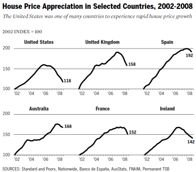
Bill Thomas, Keith Hennessey, and Douglas Holtz-Eakin, the dissenters of the Financial Crisis Inquiry Commission, did it. A while back, we discussed their chart which illustrated the following point:
The existence of housing bubbles in a number of large countries, each with vastly different systems of housing finance, severely undercuts the thesis that the housing bubble was a phenomenon driven solely by the U.S. government.
People who are confident do it: Using (sub)titles to explain how to interpret information.
Graphic standards
What’s even more impressive is when a chart without text becomes the punctum. This is possible when we create graphic standards. A graphic that shows a current and standard value at the same time is self-explanatory. You don’t have to be shy about using comparative and standard values. Average, past, budget, forecast, statistical expectations, comparable organizational units, products, or even competitors can serve as a standard value. In the chart below, we have added the average to the dissenter’s chart as a standard value. We feel that that makes it even better.
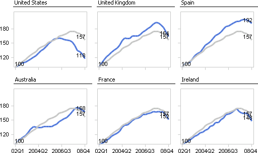
Graphic standards for analytical punctum: the closer it is, the more similar it is as well.
In day-to-day work with management reports, the variance chart is the common punctum. The vertical line symbolizes the selected standard, for example, budget data or last year’s data. If budget data is the norm, then we’d prefer “vertical accents and not horizontal disorder” to paraphrase Witzel.
Graphic standards for an agitating punctum: the more red you see, the more you need to take action!
I thanked my friend graciously for the birthday present and have had it my hands a few times since. While searching the Internet for the photographs described in the book, I even found a quote from Gursky himself. He explained that he always composed his pictures from two angles: up close, you can see the smallest detail; from afar, they become a mega symbol. In management reports, we don’t need “mega” anything. Punctum from afar; explanatory details up close. That is a worthy example to follow. Good management reports are indeed an art of their own. Punctum.
