Colors are supposed to make reports easier to read and understand. We’ve given some thought as to how that works best – and have realized: “easier” is hard with colors. So before we add to much color to your life, here are our thoughts about red, blue, and gray.
The story began like this: Someone said that some measures are neither good nor bad; they only become that way when you include a standard of evaluation. Most times, however, you don’t have one of them at hand. So until we have one, why don’t we just color the measure – or rather the graphic elements – gray? Up until now, we have always colored everything red or blue (or red and green, which is more common but harder to read.) We pondered…
Stock prices normed on a set date (for once without values): Isn’t it nice when our eyes get such clear, simple signals? The bluer and higher it is, the greater the investment yield. Redder and lower, in turn, means a lesser return. Source: DeltaMaster.
We could warm up to the idea that gray would stand for something neutral. Throughput times in production can’t always be as short as we want them to be. Buildings are rarely leased down to the last square meter. The best database server is not always available. Some value larger than 0 and smaller than 100 percent, therefore, is normal. You would have to have a reference value and then define the variances from it. More leased area is good and blue; less leased area is bad and red.
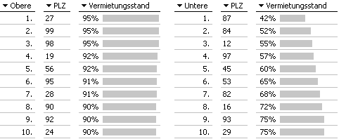
Above which value is an occupancy rate “good” or “bad”? Shouldn’t we just color it gray as long as we don’t know? Source: DeltaMaster.
Even Bella once pointed out that commodity prices are hard to judge without further information. “One man’s green is another man’s red”, she commented in reference to producers on one hand and consumers on the other. She wanted to see more gray in the Wall Street Journal, which uses the color green to represent increasing commodity prices.
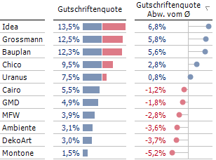
The longer we thought about it, the more constellations came to our mind that call for color differentiation. What should we do, for example, when variances on both sides of a value are undesirable? Our suggestion: color both sides red!
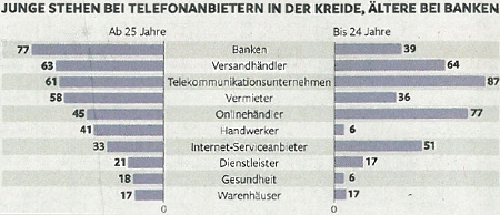
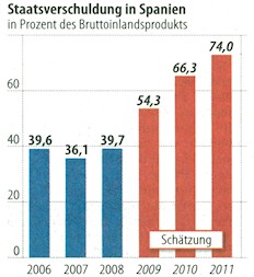
Is this a case for grey? Where young and old people have debt. Source: Die Zeit, 2011-04-08, p. 17.
We were even so motivated that we thought some more about standards for measure types, data constellations, and coloring. In the process, we even came up with a few new variations for graphical elements. For example, you could draw bars in two different colors: Everything up until the average or reference value would be shown as “good” and everything above would be bad.
When values are only bad after a certain point: draw the bars in two different colors? Source: DeltaMaster.
As expected, working out the details was a bit trickier. Here we felt that our bicolored bars need a separator. This, in turn, raises questions about differentiation because the separator lengthens the bars of values that lie above the average. Addition changes.
When two colors converge, you need to separate them. In this case, however, the differentiation of the value suffers in the process. Source: DeltaMaster.
We sorted through our collection of infographic samples, which once again was like opening a can of worms: Graphic programs work with standardized color palettes. If left uncorrected, they can send strange signals. FAZ regularly colors the first of two values blue and the second one red. The German paper “Die WELT” colors stock prices red – regardless if they rise of fall. You can argue that we use blue instead of green, but we feel that the signaling effect of red in business numbers is a widely agreed standard. We don’t see why someone would ignore it – especially in the business section of a newspaper.
FAZ colors the first of two value groups blue and the second red. Here that means that the forecasted debt is worse than the real debt. Strange. Source: FAZ, 2009-12-11, p. 21.
The Financial Times uses black and white print. Most of its graphics don’t suffer from that. Two shades of gray are easy to learn as a replacement for blue and red. If you want to draw three scenarios (e.g. good, bad, neutral), however, it becomes difficult to classify three different gray tones.
Two scenarios in gray are easy to understand, three are not. Source: Financial Times, 2010-08-23, p. 7.
We put these worries to the side for a while and deepened our thoughts. How do we deal with variances from values that we defined as being neutral? A higher occupancy rate than planned is good while a lower one is bad. That, in turn, could be colored blue and red again – which means that gray, blue, and red values would be standing next to each other.
That sounds strange, doesn’t it? First something is neutral and then it isn’t – and that is determined by a target value that could fall above or below it? Can we say beforehand if it is better to go above or below our expectations? No. An occupancy rate is not neutral. We can color that blue from the start. Availability, too. Throughput times, however, are red, just like debtors are.
What about the population of cities in which we have stores? Answer: When you report something and graphically display the differences with bars, you are doing so for a reason. Maybe we think that the larger the city is, the stronger the buying power would be? That would be good for our stores.
The more examples we looked at, the more convinced we became. As soon as we report something, neutrality becomes rare. Why should we count, report or visualize something when all value differences leave us cold? Therefore, red or blue: everything else is untrue.
