Thinking is strenuous and expensive – but it gets less strenuous and less expensive with practice. Habits can also develop through practice. So which habits can improve Business Intelligence? Here’s one: earlier lies to the left of later.
Time either flies or goes by so slowly. We either want to turn it back or stop it completely. Time rarely passes the way it should. It trickles away in the sand glass und thereby moves from top to bottom. In this blog (and all blogs for that matter), time runs backwards. It moves from the bottom to the top. For old-man Knupp in Martin Suter’s new book “Die Zeit, die Zeit” (“The Time, the Time”), it doesn’t even exist. The notion that time passes is simply an illusion.

The Human Clock project presents time thousands of different ways in a fun, playful manner. In financial controlling, variation makes it harder to understand things. Source: humanclock.com.
It’s no wonder that people fool around a lot when they are talking or writing about time. Sometimes time runs in two rows; sometimes the scale changes along the way. In time series charts, time actually always goes from the left to the right. In tables – especially those in annual reports, it is often the exact opposite. Bella already howled about that. Most corporate enterprises in Germany place the previous year to the right of the current one. Got it?
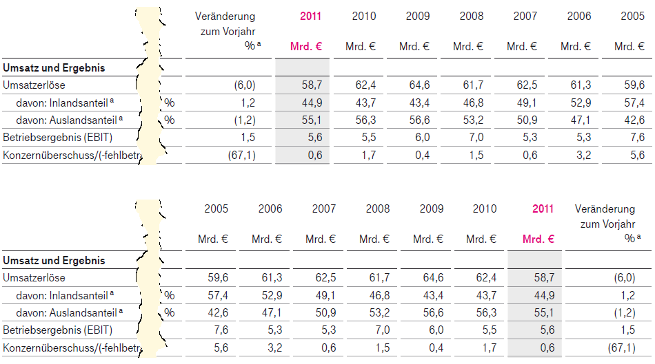
When a series of yearly values are placed next to each other, you can identify trends. Look at the top chart and see how long it takes you to understand that revenues in 2011 were at a six-year low. Source (top chart): Deutsche Telekom AG, 2011 Annual Report, p. 46. Below: Bella’s redesign. Click to enlarge
I talked this over with a friend who is a banker. She said that the report year is listed first due to disclosure requirements. This is specified in one of the paragraphs of the German stock exchange regulations – and, therefore, is standard. We, too, remembered § 265 of the German Commercial Code (HGB) from our undergrad business courses. This paragraph specifies that each item in the balance sheet and P&L statement must include the respective amount from the previous business year. It is similar in International Accounting Standards as well. IAS 1.38 also requires a comparison to the previous year but doesn’t specify the order in which companies need to display these figures. Together, we tried to find the respective passage of the stock exchange regulations through Google searches and even phone calls with institutions like Deutsche Börse. We neither found the information online nor found someone who could give us further information. If these bodies have specified the details for displaying tables in regulatory reports, they weren’t very open about it.
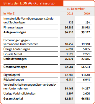
A long-established convention in Germany: The current report year precedes the previous year for comparisons. Source: E.ON AG, 2011 Annual Report, p. 41.
Whether you are dealing with a balance sheet, P&L statement, annual report, or status report, it sounds logical enough to list the numbers for the report year before the comparative values… or does it? What does your brain tell you? Glancing over a table with two columns is no big deal. No matter which way you list these values, the path that your eyes have to travel is very short. If you name the values for the report year first, the newer numbers are closer to the headings. On the other hand, these headings apply to both columns. What does a number say if you have no comparison? Not much – which is why the values for the previous year are listed.
Let’s put any possible legal requirements aside for a moment: Which standard would you prefer? In Europe, we read in rows – horizontally – and from left to right. “Earlier” stands to the left of “later”. That’s why I personally feel that periods belong in the columns of a report and never in the rows. And in the columns the periods should please run the way they do in every time series chart – from earlier (left) to later (right).
In financial controlling, we desperately wish for standards like that. We have more data than time, thinking is strenuous, and anything that we don’t quickly understand wastes capacity. I mulled over the two options above for a long time. I simply cannot teach my brain to want to understand the development of a series of numbers backwards… and why should I?
