People say that whether you use a logarithmic scale or a linear one for the development of national debt, the world population or the global climate depends on what you want to show. Wrong, we say. Linear scales regularly mislead.
The amount of debt accumulated by the USA concerns us, too. Or rather the charts about it that are in circulation. We say they are wrong, and in a very fundamental way. Because they are not adjusted for inflation, because they do not show economic growth in comparison, because presidents are inserted as explanatory variables in a manner that simplifies and distorts – and because they have a linear scale. All of this makes them “panic charts” that add fuel to the flames and cause damage instead of leading to a much needed levelheaded debate. But slow down.
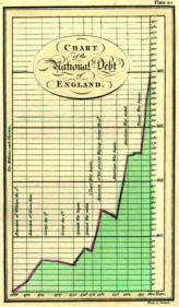
Incidentally: The Spiegel online chart resembles the very first chart on national debt down to the last detail. The latter is over 200 years old and was created by William Playfair (1759-1823).
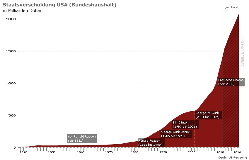
Linearly scaled: Development of borrowing by the USA since 1940 and term in office of the US presidents since Ronald Reagan. Source: Spiegel online, 2011-08-08. Click to enlarge.
Same speed, same slope
First of all: When we look at developments, what do we want to know? A development can stagnate. It can go up and down. That in turn can happen more quickly or more slowly, and take longer or not so long. The fascinating thing about a line chart is that it shows the entire sequence of ups and downs, as well as the speed of the movements. Line charts are speed charts. But not if the Y-axis is linearly scaled. Then it depends on the absolute height of the values as to whether or not the same speed is also shown the same way.
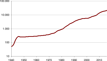
Logarithmically scaled: The data from the graphic from above. Source: Bissantz & Company GmbH, data: White House/Office of Management and Budget, Table 7.1: Federal Debt at the End of Year: 1940–2016.
We’ve already had that a few times, and it can’t be said often enough: In order to see differences in speed, the Y-axis must be logarithmically scaled. An identical line slope then indicates an identical relative change and identical speed. Comparing these two charts reveals these differences in a striking manner. We may not be able to save the world this way either, but the fact that German companies present potentially record-breaking half-yearly figures and the DAX index then crashes also has to do with how we see the future and how it is presented to us.
It depends. Really?
Sometimes objections are raised to logarithmic scales by claiming that it depends on what you want to show. After all, a logarithmic Y-axis does not readily indicate whether the absolute change at various times was identical. True. But when do we want to know that anyway? When do we want to see the rate of the absolute change?
Although the development of the debt in the USA in absolute terms certainly is a dizzying eye-catcher, it is meaningless if there is no relationship to the gross domestic product. Garnishing the chart with the presidents suggests that the debt problem is primarily linked to who was in office at the time and has only more recently taken a dynamic turn for the worse. Our second redesign shows how misleading it is to superimpose the presidents.
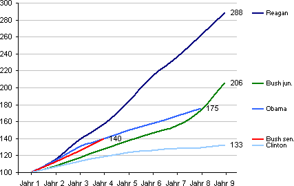
Normalized: Change in level of debt during the term in office, first year (Jahr 1) of each legislation period = 100.
What is the correct way to scale?
In general, showing the development of dimensions in absolute terms with linear scales quickly becomes a problem when dimensions with a large range are involved. Even if the key reference dimension is familiar to all the readers and it remains constant over the period under consideration. Let’s assume, for simplification purposes, that the Earth’s resources are finite and that we don’t have many more ideas in the future. Population growth will then hit a constant denominator. However, since we can only guess at the absolute upper limit of humans that the planet is capable of supporting, the denominator is not as constant as it initially appeared. Therefore, the rate of change in growth also interests us here again, independently of the absolute level.
Long, linear, and constant: A guaranteed panic chart
Anyone who thinks up a dimension whose development in absolute terms needs to be shown without being compared to another dimension should note the following: In the case of long periods, low initial values, and constant growth, a panic chart will always result that is flat for a long time at the start, and then becomes steeper and steeper until it is virtually vertical and goes through the roof. Our eyes will barely be able to avoid seeing this steepening as anything other than the reaching of a critical limit.
Then two absolute dimensions side by side
Very well, proponents of linear scaling might argue, then we’ll show the US debts and the gross domestic product in the same chart so that we have our comparison. That’s not much good either, as we have seen before with US figures. Since both dimensions start at different levels, what appears to be a parallel development would be equally misleading.
As I simply cannot come up with an absolute dimension for business purposes where the development of the absolute growth would be enlightening, I will proceed as follows:
- If I have two or more dimensions for comparison, I use our little lie-chart detector to check whether a linear scale would lead to distortions and I therefore need to use a logarithmic scale.
- If I have just one dimension, I take two contrasting segments from the development and can likewise use the lie-chart detector.
Pretty tricky. Therefore, it’s never wrong with logarithmic scales, and rarely right with linear ones. We will have a look at whether that also applies to percentage values in the near future.
Continued: Simply wrong is downright difficult
